Celebration guide
Planning a Colour Palette for a Cookie Set
Choose a main colour and accents from confirmed available options so different cookies form a visually connected set.
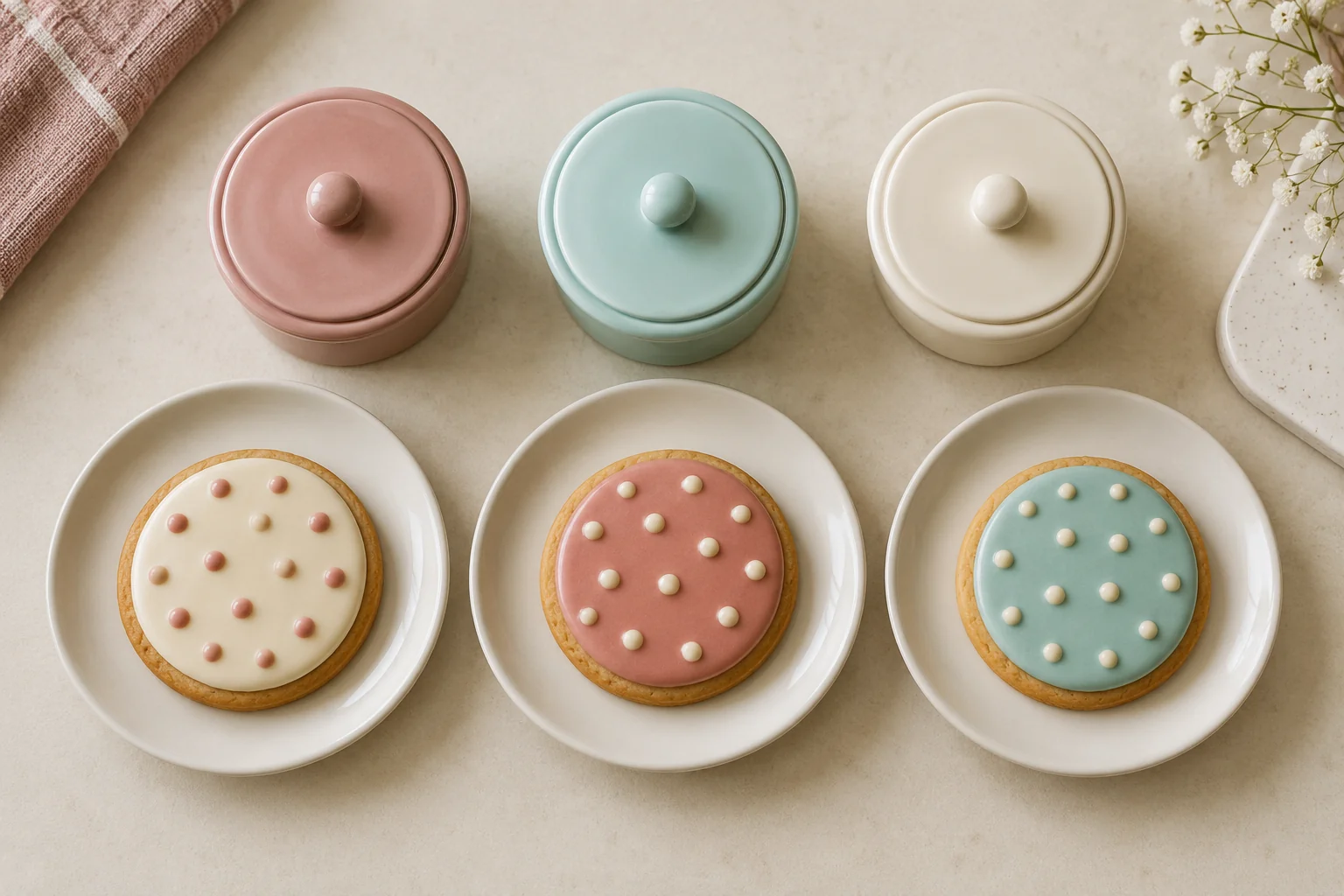
A cookie set does not need identical patterns to look connected. Colour relationships can provide unity even when shapes and accents differ. Palette planning helps participants select a main colour, leave room for accents, and avoid making too many decisions when decorating begins.
Start with colours actually available in the chosen product or confirmed materials. This article concerns colour roles in appearance, rather than colouring recipes or ingredient mixing instructions. Cream, rose, and aqua are visual examples that can be replaced with available choices.
Define the mood and trial boundaries
Choose a few words describing the intended impression, such as soft, bright, or simple. Connect them to the event or participants’ preferences without assuming a colour means the same thing to everyone. These words guide relationships rather than establish absolute rules.
Limit the first trial to a few colours. Two or three choices provide enough comparison without filling the table with materials. If only one colour is available, empty space and pattern can still create variation across a set.
Consider the cookie shape and how many areas will be decorated. A small surface may need only one main colour and a short accent. Avoid selecting a palette solely from a large example with a different amount of space.
Choose a role for each colour
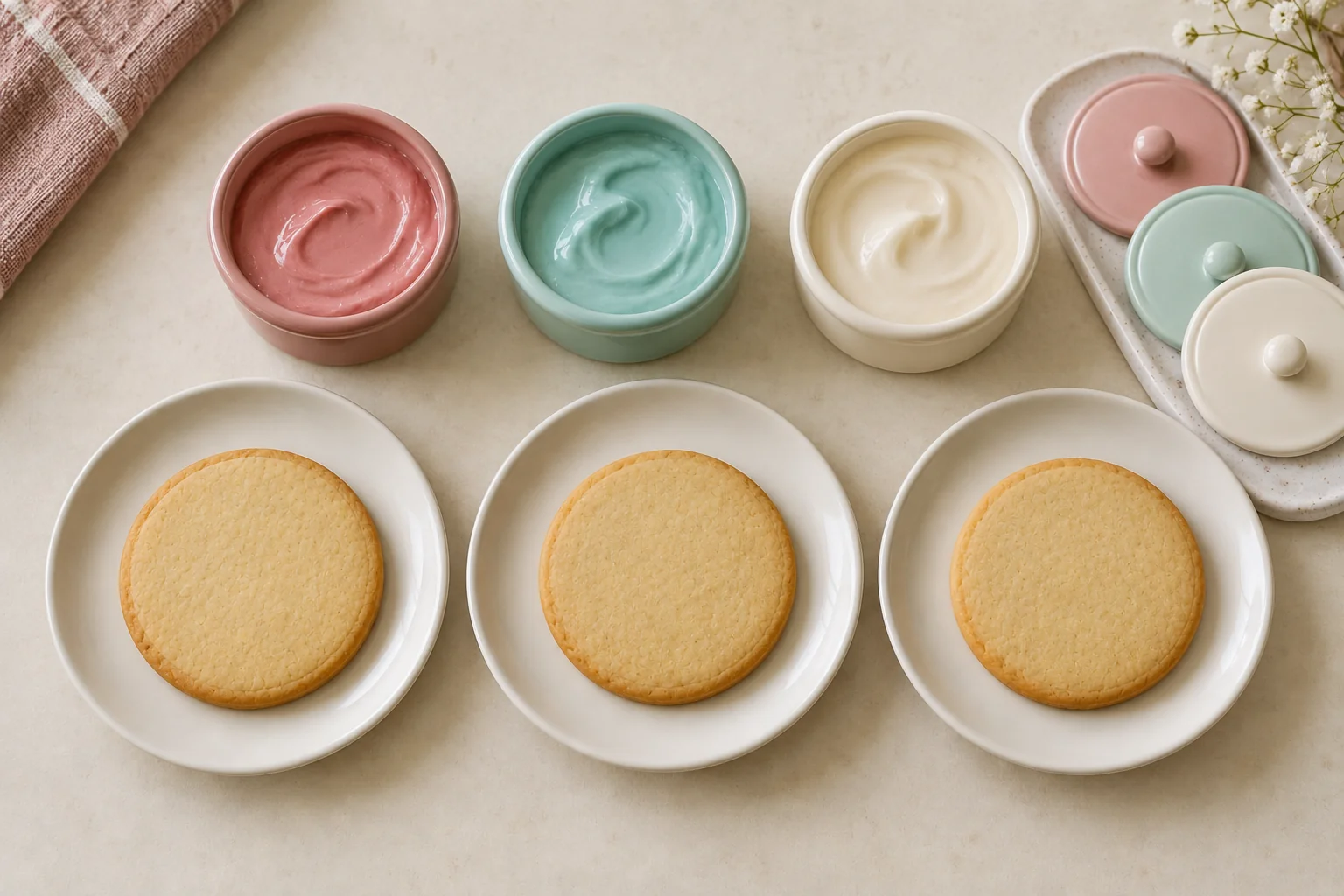
Identify one colour as the main surface or most frequently repeated element. Assign the others more limited accent roles. Cream could connect the set while rose and aqua appear in small dots or lines.
Roles are not determined only by quantities in the packaging. A plentiful colour can still be used as an accent under the plan. Confirm material sufficiency through product information and instructions rather than estimating quantities from image areas.
Write a short role note. Every cookie might have a cream area, each receives one rose accent, and aqua appears in only a few dots. The note helps participants understand the intended relationship before decorating.
Try the relationship on a small area
Use a practice medium suitable for the materials and activity. If decorating material is used for a trial, the surface and handling must follow product instructions. A small test lets available colours be seen together.
Observe whether an accent remains visible on the main area and whether the combination fits the initial preference. Screens, light, and reference photographs can alter colour impressions. Use the actual materials as the decision reference rather than relying entirely on a picture.
If the combination feels busy, reduce accent frequency first. Replacing every colour is not always necessary. One limited change helps determine whether the issue comes from the colour choices or the number of filled areas.
Repeat the colour relationship across the set
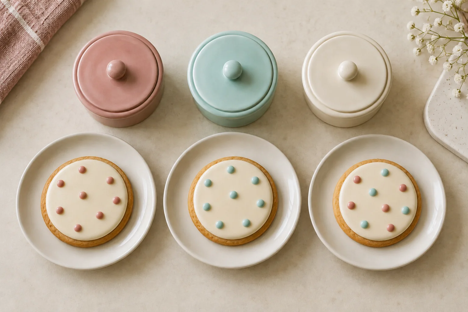
Begin with one cookie using the written colour roles. Then consider how another pattern can use the same relationship. One cookie might have a rose line, another rose dots, and a third an aqua accent, while the cream area repeats.
Differences in shape do not need to disappear. A set can feel connected through its main colour and comparable accent amounts. Leave enough space for each element to be visible, particularly when participants are still learning the decorating tools.
Avoid adding colours continuously just to make every cookie different. Variation can come from position, spacing, or line shape. If another colour is introduced, define its role first so the original relationship remains readable.
Compare the set as a whole
Arrange decorated cookies according to product handling instructions and view them together. Ask what repeats and which part stands out most. This comparison concerns visual choices rather than judging different participants’ abilities.
| Question | What to look for |
|---|---|
| Connecting colour | An element present across most of the set |
| Accent | A difference that still feels related |
| Empty space | A pause that helps the pattern read clearly |
| Balance | No cookie dominating unintentionally |
If one cookie looks very different, decide whether that difference is wanted. A special accent can be intentional. Every variation does not need to be identical simply because the cookies form a set.
Adapt the exercise for participants
For a group, show examples of colour roles and let participants choose their own patterns. A supervisor can explain a simple aim, such as repeating one colour. Avoid requiring everyone to reproduce the example exactly.
Match the number of choices to available time and participants’ abilities. For a short activity, one clear colour relationship can provide direction without numerous instructions. The DIY cookie activity guide helps prepare the broader sequence.
When asking through Sweetalicious, describe the intended palette and confirm colours and materials available in the selected product. Example choices in this article do not imply every kit contains them. Confirm availability before finalising the brief.
Keep decisions you want to repeat
Record the main colour, accents, and one pattern that clearly expresses the relationship. If helpful, keep photographs using the cookie result documentation guide so the reference is easy to revisit.
A planned palette makes decorating choices easier to manage. A few colours with clear roles can connect many patterns, leave room for individual variation, and create a visually related set without requiring every cookie to be a copy.