Celebration guide
Logos on Cookies: Choosing a Design That Reads at a Small Size
Assess cookie logos at final size, retain readable details and approve artwork changes with the brand owner.
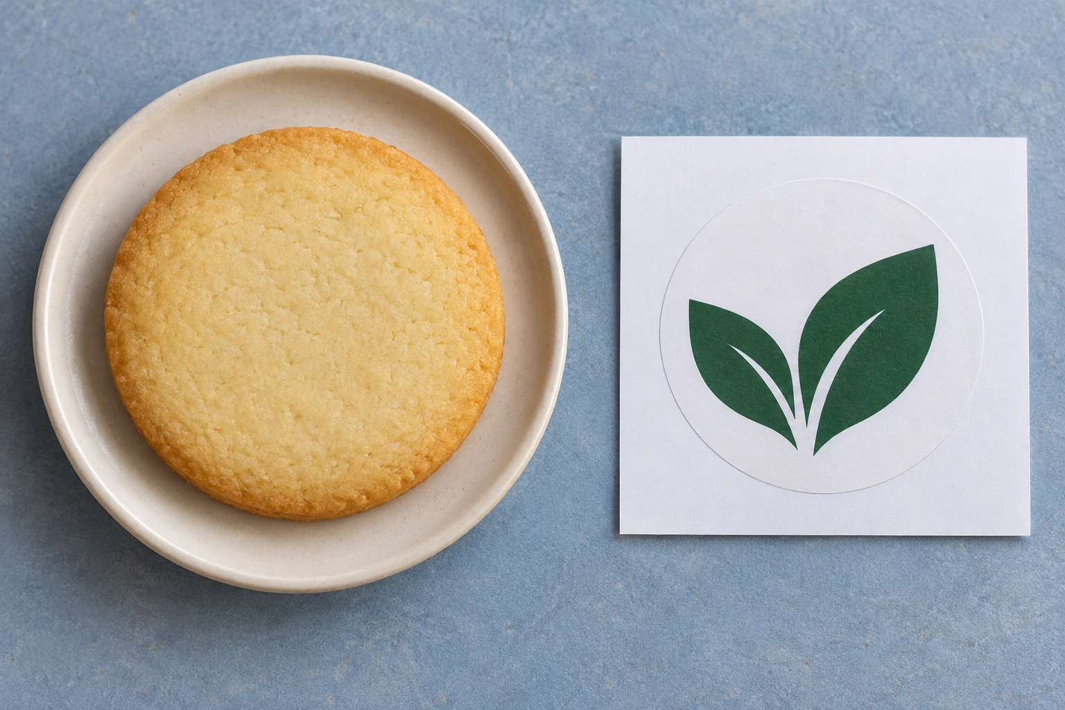
A logo on a cookie needs to be judged at its final size, not only enlarged on a screen. Fine detail, tiny lettering and close lines may lose readability within a small area. Start with a good source file, then check whether the main identity remains recognisable at the intended print size.
The aim is to preserve identity rather than redesign a logo without permission. Removing a tagline, rearranging elements or using a simplified version requires the brand owner’s approval. Use artwork you are entitled to use and state the change boundaries early.
Test at the final edible size
Agree on the print area with the producer. Do not assume the entire cookie can be printed to its edge. Product shape, surface and cutting arrangements may affect the design area actually approved.
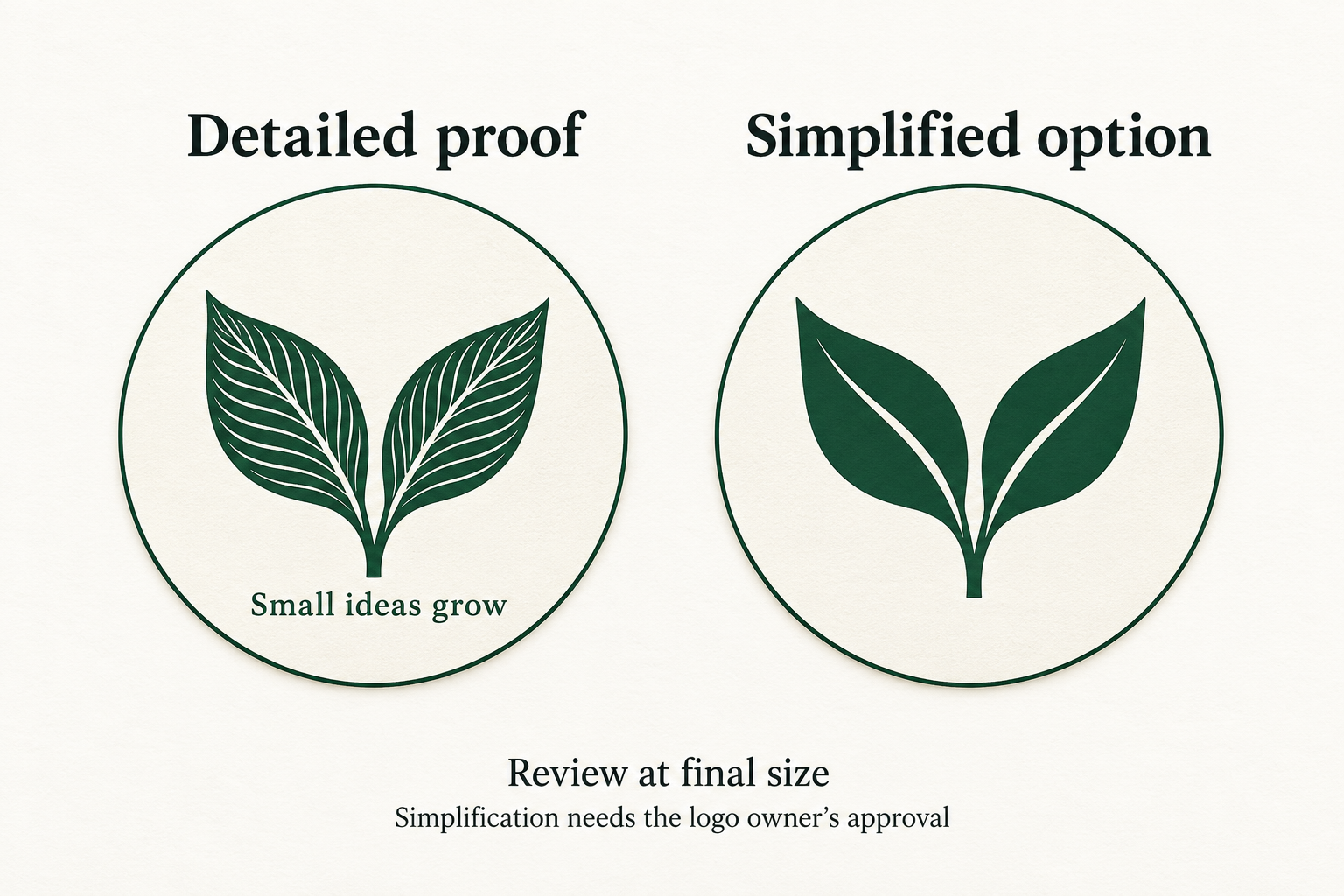
View a proof at final size from a normal viewing distance. A logo clear on a large screen may not read when small. Enlarging the proof whenever something is hard to see does not resolve that problem.
Compare the full design with an authorised simpler option. Keep the area the same for a fair comparison. If the second version is larger, it is unclear whether reduced detail or increased size helped.
Separate essential and additional elements
Ask which elements must remain. The symbol, brand name, particular colours and clear space may be part of the identity. A tagline or long address may have another approved usage, but that decision belongs to the identity owner.
Do not invent an abbreviation because the name does not fit. Request official alternatives where available. A horizontal layout, symbol-only version or another arrangement should come from approved materials rather than guesswork.
| Design element | Question for the logo owner |
|---|---|
| Symbol | Must this form remain complete? |
| Name | Is there an approved compact version? |
| Tagline | May it be omitted at a small size? |
| Colour | Which colours have priority? |
| Clear space | What surrounding boundary must remain? |
| Changes | Who can approve the final proof? |
Keep answers in the brief. When several colleagues provide feedback, one person needs to approve the final decision so revisions do not conflict.
Assess lines and contrast realistically
Check whether fine lines still separate important parts. Notice tiny text becoming indistinct marks and colour areas merging. Describe the observed problem without inventing a minimum font size for a printing process that has not been confirmed.
Contrast can help readability but does not authorise a brand-colour change. If a background makes the logo difficult, ask about permitted options. Discuss size, material and colour results with the provider for the actual process.
Cookies By Shar’s logo-cookie examples illustrate branded imagery on products, but their capabilities and terms are not Sweetalicious specifications. Use a proof and confirmation for your own requirement.
Send the file and brief as one reference
Use the best available source file rather than a screenshot from a conversation. Include the intended size, orientation, elements to preserve and approved usage examples.
If adjustments are needed, Sweetalicious’s catalogue includes Edible Print Image Editing. Describe the composition or layout requirement and confirm scope. An editing service does not automatically authorise every change to the brand identity.
Separate final artwork from versions still being discussed. Give files distinguishable names and identify one copy for approval. Avoid sending several nearly identical images without saying which one should be used.
Approve with the full context
Read the proof at the intended size, not only in a preview. Check lettering, element order, orientation and logo version. If several cookie variants are involved, confirm that the approved proof refers to the right one.
Describe revisions specifically, such as “use the owner-approved version without the tagline”, rather than “make it better”. After revision, review the latest file so approval does not accidentally refer to an older copy.
When receiving the result, compare it with the agreed points. An enlarged photograph can assist inspection, but assess readability at the actual usage size too. Keep the approval information needed for order follow-up.
A proof is also a chance to resolve competing priorities. If keeping every element makes the result too crowded, ask the owner to choose between an approved smaller identity or another suitable product format. Do not quietly remove content to make the layout fit.
For a repeat order, refer to the approved artwork version while checking whether the size and product remain the same. Previous approval does not automatically cover every new size. A smaller format may require another readability review, even when the source logo file has not changed.
Start with preparing edible-print artwork if source material is not ready. When speaking with Sweetalicious, bring dimensions, official files and an approval owner. A small logo works better when retained details are chosen deliberately.